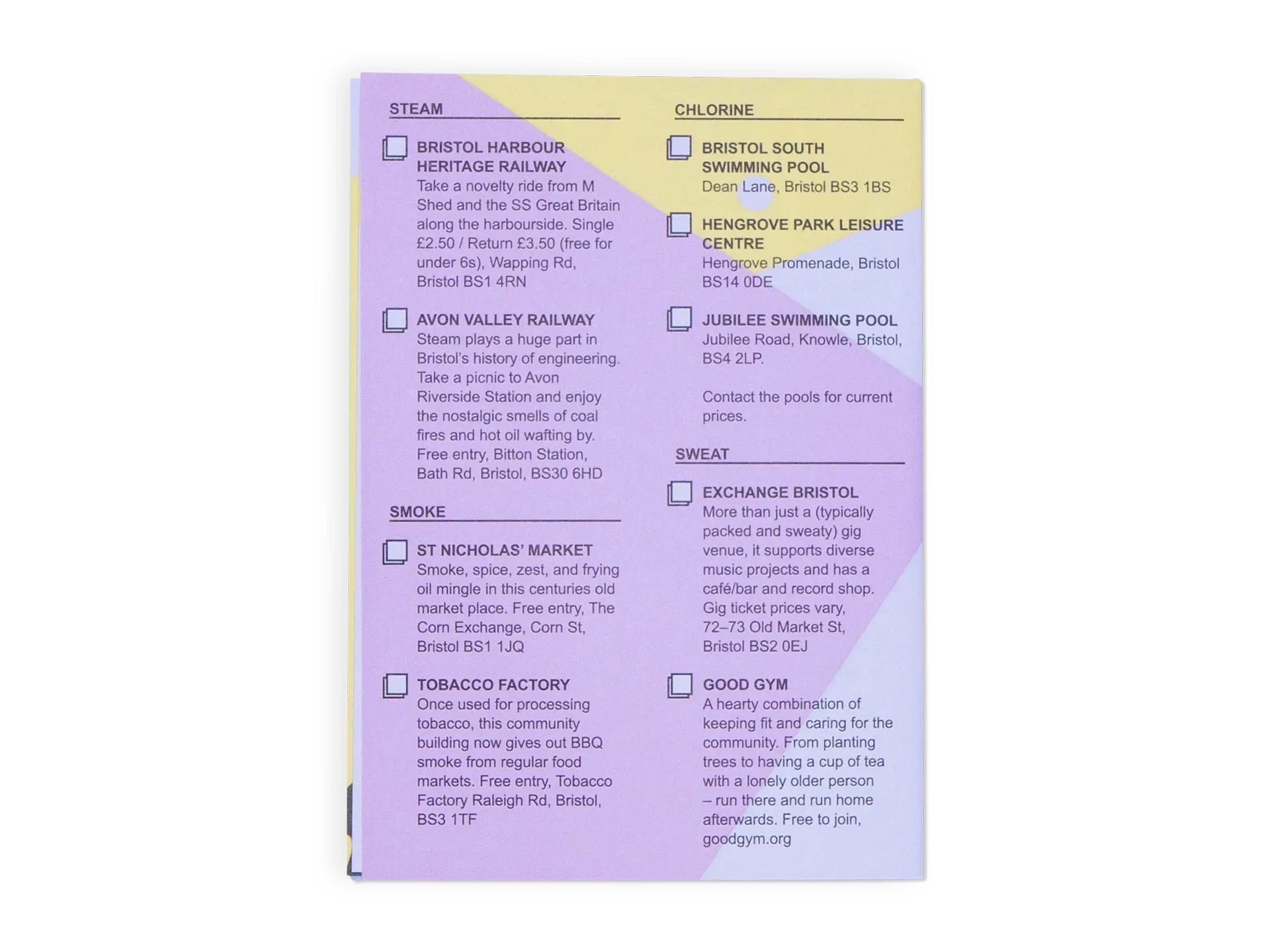
Bristol / City of ...
Bristol / City of ... is a series of alternative guides to inspire its reader to explore Bristol via the senses. Smells is the first in the series and offers writing, places to visit and top tips for anyone equipped with a nose.
I created a brand for the series and designed this first issue. The aesthetic is inspired by home made zines and pamphlets, to reflect the the on-a-budget nature of the publication itself.
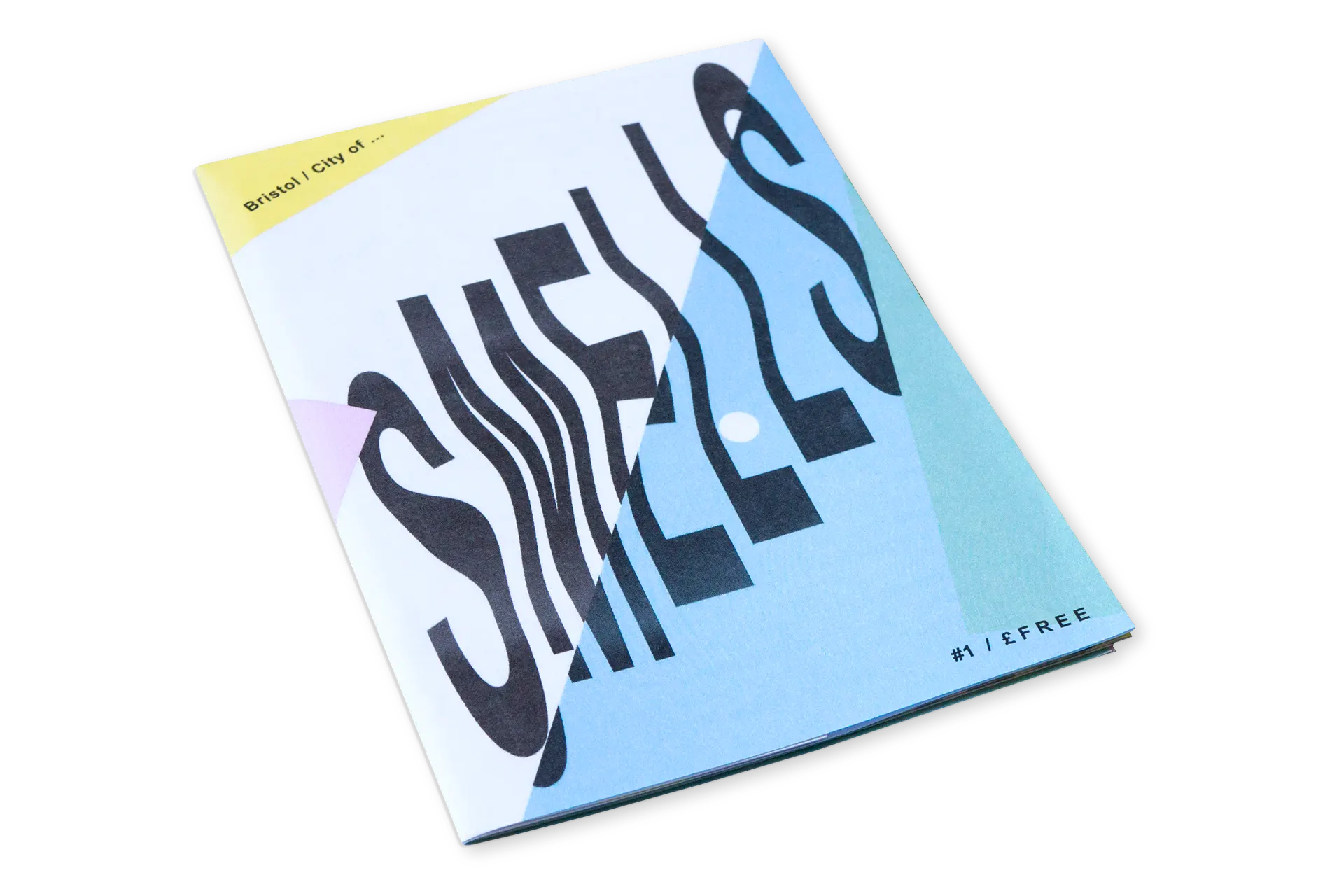
The layered textures and colours are taken from the pastel shades of copier paper you might find scattered on the floor of a photocopy room, while the glitchy title text comes from a print-out I manipulated on a photocopier. I wanted the typography to reflect the low-fi, default styling (typically Times New Roman) found in the newsletters and pamphlets that might get stuffed through your letterbox by a local community group.
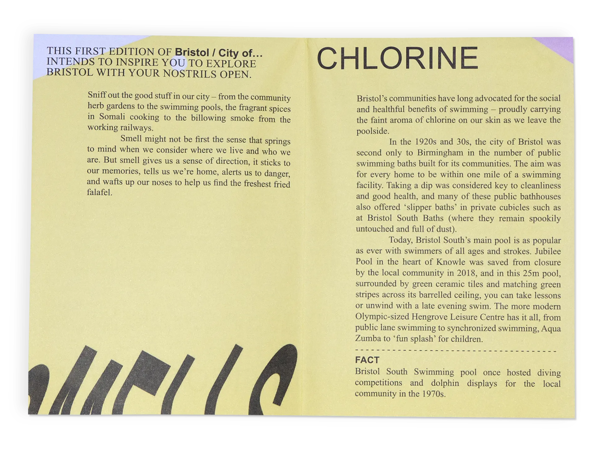
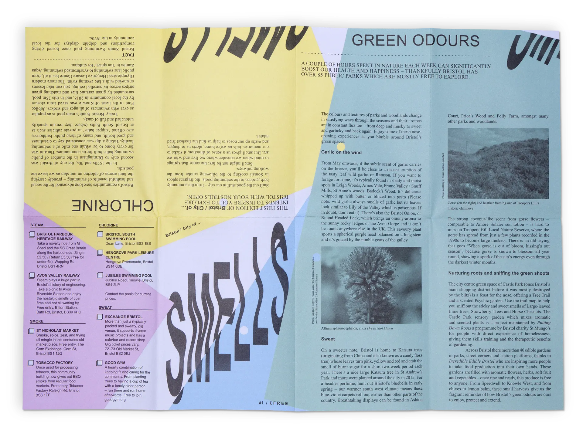
As the reader unfolds the pamphlet, the layered paper textures that make up the background begin to be revealed
| Client: | Self-initiated collaboration with Jane Faram |
|---|---|
| Agency: | Atomic Smash |
| Expertise: | Brand; Illustration; Graphic Design; Editorial |
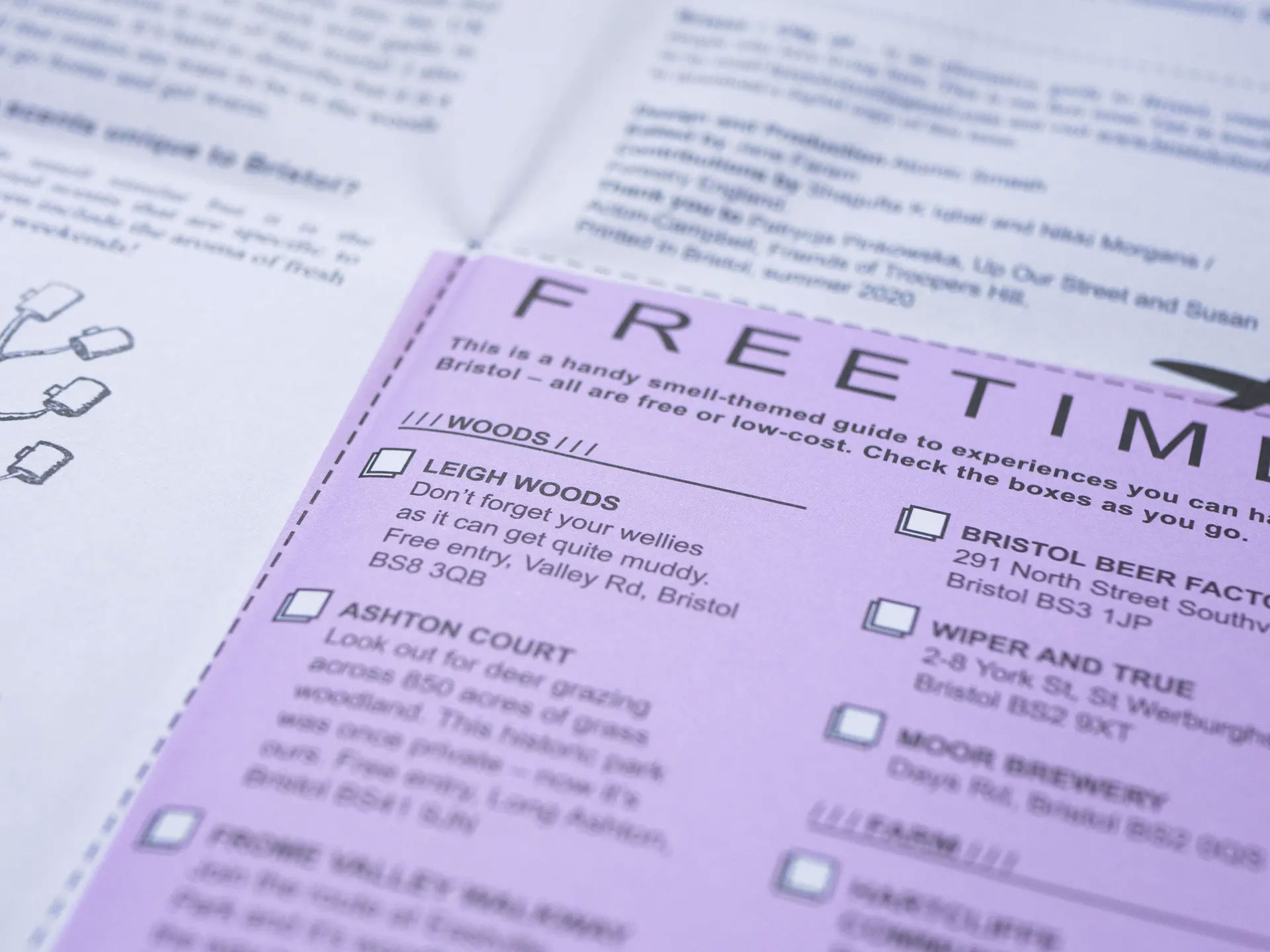
The pamphlet includes a cut-out section entitled Free Time, with quick and free activities to sniff out
